
During my semester at Imre, I was asked frequently to help in the completion of client pitch decks with fast approaching deadlines. Working within small time windows to get the content out, it was becoming evident that finding designers to hop in on slide decks was a stressful and ongoing battle for creative resource managers.
My experience working on decks for clients with tight design constraints was a challenging and valuable experience as I was constantly required to recognize the branding guidelines in place and act quickly to fulfill the design request. When I was asked to participate in a Spotify case study as a creative overseer, I was able to quickly take the lessons I had learned in the small space and apply it to a scenario in which I was given more creative license in the overall outcome of the final product.
The intent behind this project was to address the current user base pain points with the overall user experience specifically in a mobile app scenario. Though Spotify is an incredibly successful giant in the streaming landscape and audio world, after extensive research we discovered that there were several areas that current users felt needed improvement.
Pushing podcasts
Some of the issues stemmed from Spotify’s recent adoption of podcasts as many found the algorithm was seeking to push its new podcast content forcibly rather than organically.
Advertising on a premium service
Many users find that they are still running into advertisements despite paying for an “ad-free service”.
Further Social Capabilities
On a different topic, much of Spotify’s loyal user base joined for the purpose of streaming music in a socially enhancing environment. Consequently, users wished for further enhancements to the app's social capabilities.
THE PROBLEM
AUDIENCE LANDSCAPE

Working closely with two members of the social marketing team, I was tasked with heading the creative direction of the proposed changes. With occasional support from UX team members, I began envisioning a new framework that would alleviate the current grievances.
Acting as the sole creative on the team, I organized and coordinated all aspects of the design including: user experience, content prioritization, interaction, device mockups, visual and branding elements, and the slide deck creation.
TEAM & ROLE
DESIGN PROCESS
Overall, the basis of the UX changes were grounded upon the goal of winning back Spotify’s loyal music-focused user base as well as enhance the already-present social capabilities. In order to decide whether or not these changes were worth being made, we started out by organizing focus groups of current users. After examining the key pain points across different user groups; we were able to to establish three key changes that we felt would enhance the user experience:
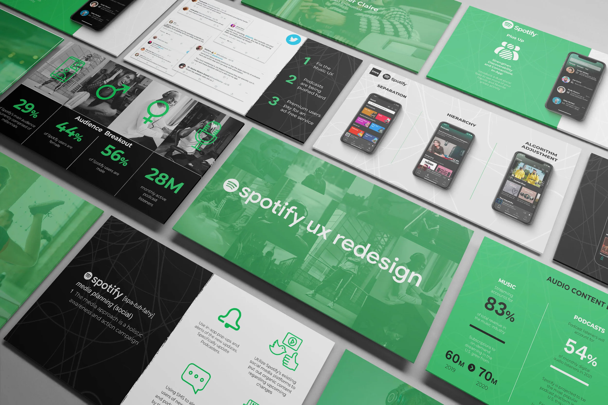
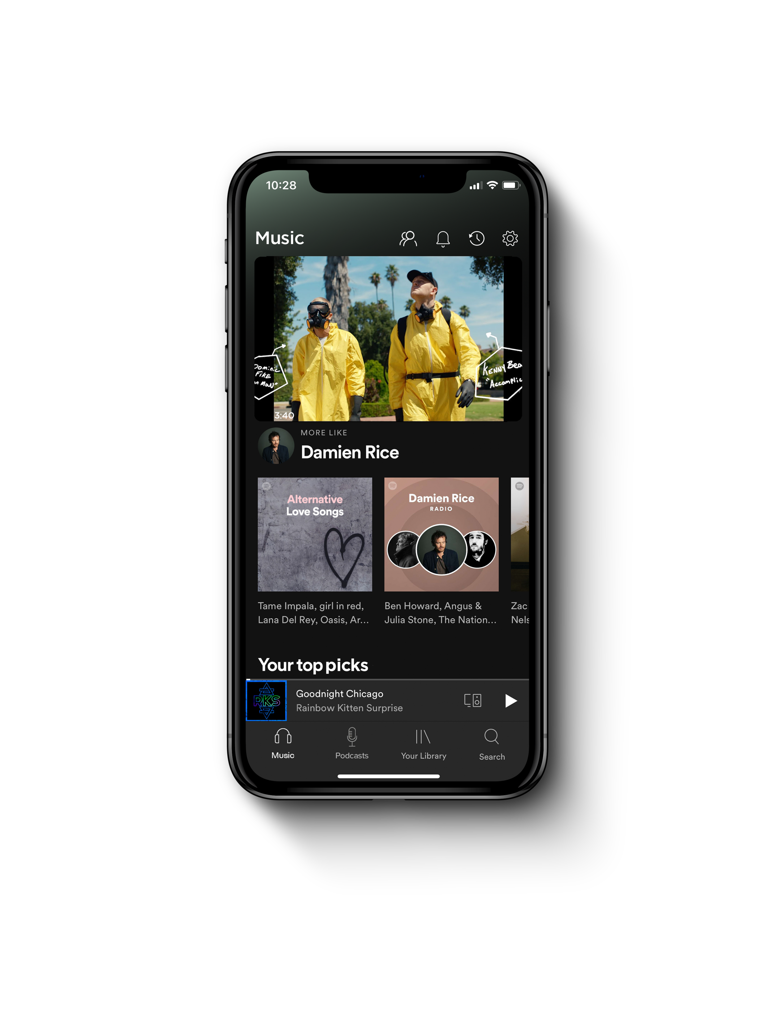
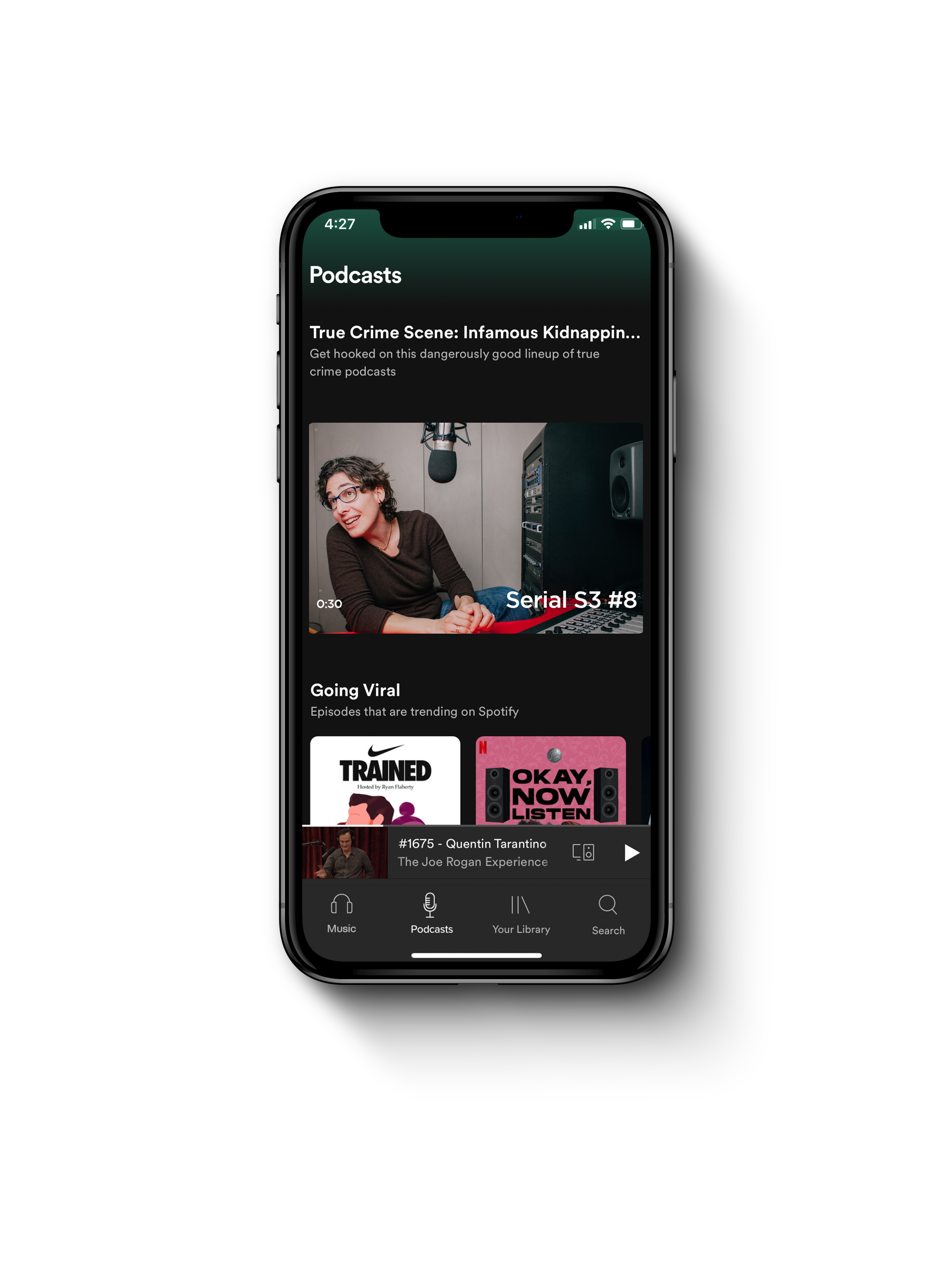
Seperation
Users felt that oftentimes the collection of content being pushed by the app was lumped into a jumbled mix of albums, playlists, and podcasts. By providing music and podcasts with their own individual landing page, we felt that we could offer the user a more organized selection of each type of content.
Hierarchy
Next, we found that users were struggling to prioritize the content within the individual pages. Therefore, we wanted to place an emphasis on drawing the user’s eye to the more important content.
By establishing visual hierarchies and video carousels, we found that the app was able to prioritize the content in a much more succinct fashion so that the user could absorb the content that they found most interesting.
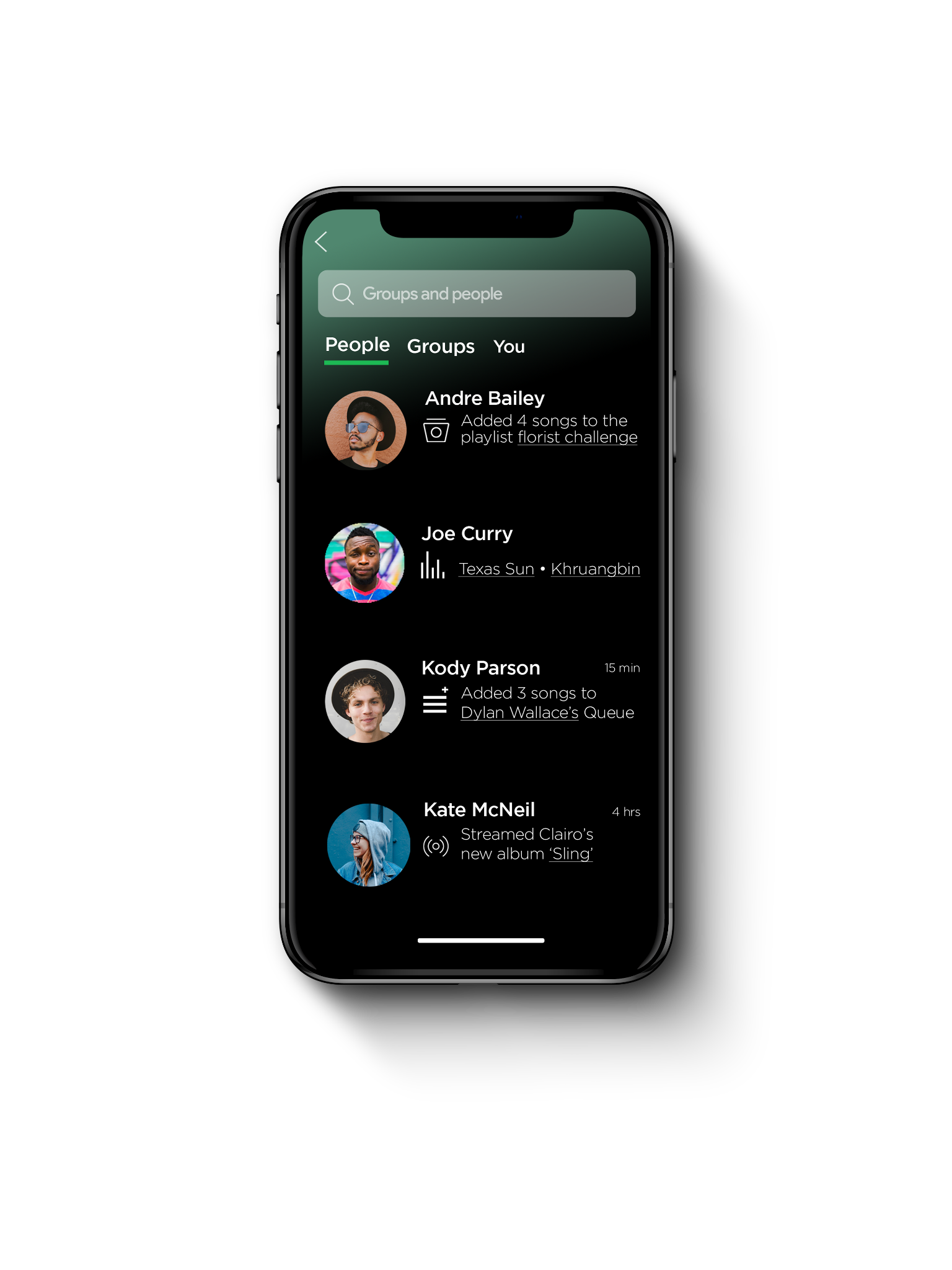
The Feed
Lastly, in order to enhance the users social capabilities, we created a feed in which users could see what their friends were listening to.


We discovered in our “current user” scan that as far as Spotify’s current color schemes, icons, and other branding elements, users were relatively happy with its current look and feel. For this reason, I aimed to mirror much of Spotify’s current aesthetic in the deck, as I felt the changes being proposed were much more to do with the UX philosophy rather than the design qualities. If we were to stray from the branding guidelines completely, the changes suggested might seem far too drastic.
You can view the full deck below:
THE DECK

Click Here
The case study was well received within the company. While the changes to the Spotify’s streaming service were hypothetical, many expressed that they would like to see the proposed new features go into effect as they reflected similar issues and concerns with the current UX.
OUTCOME